-
 BC
14.2kThe definition first:
(in modern architecture) the aesthetic use of basic building processes with no apparent concern for visual amenity. ... The term was first applied to functionalist buildings of the 1950s and 1960s that made much use of steel and concrete in starkly massive blocks. ... The term originates from the French word for "raw" in the term used by Le Corbusier to describe his choice of material béton brut (raw concrete). British architectural critic Reyner Banham adapted the term into "brutalism" (originally "New Brutalism") to identify the emerging style.
There are examples of béton brut style that are distinguished, and there are examples which are properly loathed by one and all.
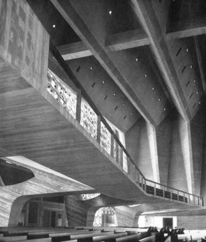
For quality, Breuer's Abbey is an outstanding example of what can be done with raw concrete.


An Eastern European Soviet monument is also a good example of quality.

Béton brut or Brutalism fails most horribly when it is neglected. Lots of buildings in the world have been neglected, but béton brut is oddly sensitive, for all its raw mass.


No doubt there are factors contributing to extreme ugliness: the quality of the concrete, the way it was cured, the location of the building, how the building sheds water, and (most basic) the design of the building. Maintenance, of course. Nothing man made can keep its looks without upkeep.
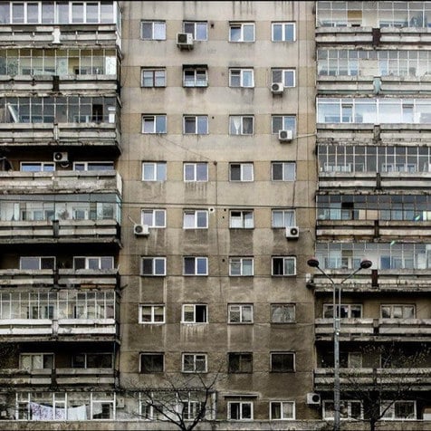
The first Soviet-style housing unit suffers from several design and maintenance decisions:
Most prominently, the concrete is crumbling, cracking, discoloring, and streaking. Streaking one can understand -- deposited soot + rain = streaks -- it's inevitable (but it can be cleaned off). Discoloring may be cosmetic or more serious. But the really serious problem is crumbling material. Concrete cracks. In cold climates there are two kinds of concrete: cracked, and not cracked yet. But cracks in buildings can be repaired to reduce re-bar rusting, more cracking, and continued crumbling. It's noisy, time consuming, expensive, and recurring work -- but far cheaper than replacement.
The other problem with this building is that the aesthetics of design are poor--from the shape of windows inset into the concrete section, to the design of the ribbon window sections. Mullions and transitions are minimally designed -- if one can call it that at all. (No architect anywhere has figured out an attractive way to mount air conditioning units on the exterior walls of a building.)
It is possible that the interior spaces of this building are excellent and even cherished by the residents. I'd be very surprised, but it is possible
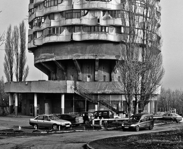
The second, round, housing unit is more of a success, though it too is suffering from a failure of maintenance.
The shape -- cylindrical central core serving a larger round building -- presents some inherent design problems. The high-end round Marina Towers in Chicago share the problem with this building: rooms and floor plans take on odd shapes out of necessity. Alternating bay windows and balconies is a good idea. The windows could stand a better design, and the whole thing probably looked pretty good when it was new. Concrete structures should last longer than 50 to 75 years. At 50 or 60 years, they should NOT look like they are ready for an implosion crew.
There is something inherently demoralizing about living in a crumbling building which has become brutally ugly (in a way it wasn't to start with). My guess is that heating, electrical, and plumbing services, fixtures, walls, stairwells, and so forth are all in discouraging condition in both buildings, with leaks, shorted out circuits, buckling tile (if there is tile), peeling paint, more dirt, and so on--not to mention vermin. (It usually isn't the people, it's usually the building.)
I've lived in roach infested slum dwellings that were 75 to 100 years old and were not in good shape, but the better built ones were recoverable, whether they were wood frame or brick. Once concrete is sufficiently cracked and crumbled, extensive re-bar exposed, too many systems failing, restoration becomes much more expensive than replacement.
Raw concrete is a good thing -- it can be beautiful, long lasting, very strong, and easy to keep maintained if not neglected. -
 Jamal
11.7kI've only got a few minutes so I'll keep it kind of short.
There's been a noticeable surge in affection for Brutalism lately. There have been books, documentaries, and blogs dedicated to it. A good site for pictures is the popular Fuck Yeah Brutalism.
One thing I've noticed is that the fans fall into two camps: those for whom it is, or once was, a genuinely viable architecture, and one that is aesthetically beautiful; and then those who, a bit like fans of horror movies, are attracted to what they see as the frightening, ugly, oppressive--and "brutal"--qualities of Brutalism.
I don't want to be too sniffy about this latter group, but I do think Brutalism deserves attention as architecture for people to live and work in, and not simply as photography and computer graphics that serve as backdrops for dystopian video games and sci-fi movies set in crumbling chaotic futures.
As to what's wrong with it, well, many conservative, traditionalist commentators, such as Roger Scruton, have declared that the central problems were thinking you could change the way people live, and thinking you could throw away centuries of architectural tradition and start afresh. Thus Brutalism and the Corbusian tradition of modernism that inspired it were too ambitious, too optimistic, too radical, and too totalitarian.
I think they're wrong about that, mostly. I don't believe that people are innately suited to living in little houses with front and back gardens, built side-by-side along a road, as Prince Charles and the creators of Poundbury imagine. The Brutalist visionaries challenged it, and though they failed, I don't think it was because their ideas were bad (well, not all of them anyway).
On the other hand, some people here may remember my first or second topic on the old PF, called "Anarchist Traffic Engineering", about the Shared Space movement in town planning. In that discussion I was advocating an approach to urban space that was pretty much the complete opposite of the kind of planning associated with post-war modernism, with its segregation of pedestrians and traffic. I'm not sure how to reconcile this.
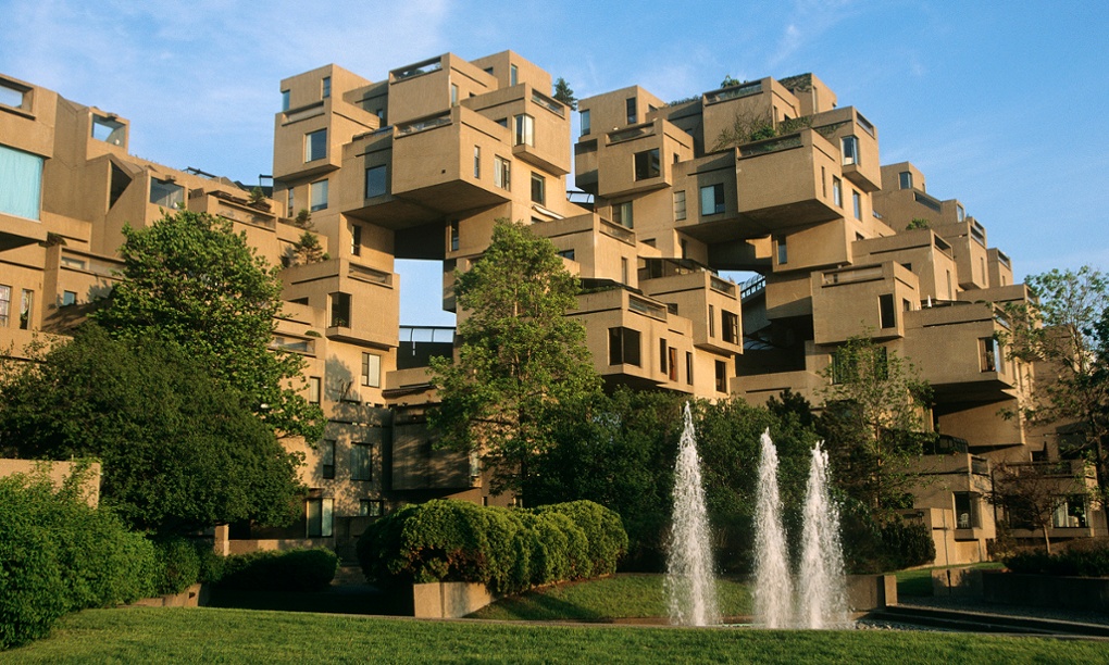
Anyway, that's all for now. Here's a picture of Habitat 67:
-
 BC
14.2kApparently Habitat worked out pretty well. I've always liked it. It's still novel. I don't see the style being used in cold climates -- too much exposure, frozen pipes, all that, but given global warming... I've been following "Fuck Yeah Brutalism" for years.
The "little houses with front and back gardens" are every bit as prone to social dysfunction as Pruitt-Igoe in St. Louis, Missouri. A film, The Pruitt-Igoe Myth (available on YouTube) takes the view that it was the crashing economy In St. Louis that wrecked Pruitt-Igoe, not the built environment. Detroit has miles of once lovely street scenes that are now an abomination of desolation.
The high rise Gold Coast communities in Chicago that house the wealthy have not turned into slums, oddly enough. It isn't architectural niceties that keeps the rich riff raff from dealing drugs, shooting people in the lobbies, or urinating in the stairwells. To eliminate the racial issue, box up a couple thousand po' white trash from Alabama and transfuse them into an elite building. You'll have a shithole in a couple of years (if that long). -
Cavacava
2.4kThey seem very masculine to me, hard and unemotional. All that massiveness wants to overwhelm the individual. I like the ones with the lower flat roofs, perhaps because they do not reach for as much as the higher ones. It was the vogue in 50s/6os, during the post-war expansion period, an expedient product of that time which has shown some legs. -
 The Great Whatever
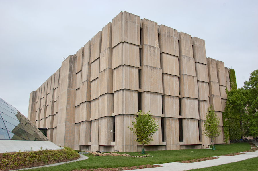
2.2kI've never had much of an eye or head for architecture, but brutalist buildings have always struck me as beautiful. I especially like when weather staining is incorporated into their design. There's a brutalist-looking library in Chicago that is fringed to look like a bookshelf, with natural staining between the pages. It's really gorgeous.
-
 Marchesk
4.6kI wouldn't call that gorgeous. Interesting and different, certainly. It sort of reminds me of the Borg. Or beehives. It sort of looks like a forgotten temple one would stumble across in the jungle.
 -
 _db
3.6kI thought I might never see the day in which we agree on something.
Sarcasm aside, I'm with you on your aesthetic appreciation of brutalism. I enjoy it as well. It's different, mysterious and yet plain. Industrial but not toxic.
Reminds of the architecture you would see in a Soviet-era Russia. -
 Benkei
8.1kThe Dutch Ministry of Finance is housed in a brutalism building. At one point it became very old and the decision was to restore (and change drastically) because it was one of the few surviving buildings in the Netherlands of this style. So we have a lot of elements retained from it.
What they've basically done is enclose the exterior with glass, giving it a much lighter feel than it used to have. There's a collection of photos here.
http://www.reflexxion-architecture.eu/?page_id=2124
This is the old building:

-
Cavacava
2.4kThe Dutch Ministry of Finance is housed in a brutalism building
It does not appear to have the Brutalism style anymore, I'am sure it is lurking here and there in the building, but the overall effect is too light, airy, clean, transparent and inviting to be Brutalism (IMHO). It was emasculated. -
 Benkei
8.1kIt does not appear to have the Brutalism style anymore, I'am sure it is lurking here and there in the building, but the overall effect is too light, airy, clean, transparent and inviting to be Brutalism (IMHO). It was emasculated. — Cavacava
If you look closely, you'll see that that's mostly cosmetic. It appears "airy" because they covered the inner courtyard that used to be open with a glass roof. -
 BC
14.2kInteresting.
Seems like a successful and worthwhile renovation, even if it has covered over and softened the edges. Worse, far worse, atrocities have been committed. It's better to cover up a still-long useful building with a glass curtain than to tear it down. This looks more like preservation than repurposing.
Some very sturdy but now defunct department store buildings have been given that treatment. Huge floor space, concrete and brick, but homely. They can be gutted (fairly) easily and serviced with updated utilities at a reasonable cost. "The building" is still there, but for all practical purposes, it isn't the same thing.
Low-rise, wide concrete structures of this design can sometimes look like pre-fab slab buildings, even if they are not. (I'm not sure when they started using pre-fab slabs in office buildings.) Nothing wrong with prefabricated slabs, just that it's early uses didn't rise above the aesthetics of low cost parking ramps. These days a lot of attractive elements are prefabricated (even on 60 story building exterior elements).
Welcome to The Philosophy Forum!
Get involved in philosophical discussions about knowledge, truth, language, consciousness, science, politics, religion, logic and mathematics, art, history, and lots more. No ads, no clutter, and very little agreement — just fascinating conversations.
Categories
- Guest category
- Phil. Writing Challenge - June 2025
- The Lounge
- General Philosophy
- Metaphysics & Epistemology
- Philosophy of Mind
- Ethics
- Political Philosophy
- Philosophy of Art
- Logic & Philosophy of Mathematics
- Philosophy of Religion
- Philosophy of Science
- Philosophy of Language
- Interesting Stuff
- Politics and Current Affairs
- Humanities and Social Sciences
- Science and Technology
- Non-English Discussion
- German Discussion
- Spanish Discussion
- Learning Centre
- Resources
- Books and Papers
- Reading groups
- Questions
- Guest Speakers
- David Pearce
- Massimo Pigliucci
- Debates
- Debate Proposals
- Debate Discussion
- Feedback
- Article submissions
- About TPF
- Help
More Discussions
- Other sites we like
- Social media
- Terms of Service
- Sign In
- Created with PlushForums
- © 2026 The Philosophy Forum


