-
 BC
14.2kThe nature of the medium always matters; water color behaves differently than acrylic. Bronze behaves differently than marble. and so on. The same goes for architecture, except that it is critical that the media of architecture (steel, concrete, terra cotta, etc.) perform as specified, else the tower will fall down.
I toured several buildings in Chicago 3 weeks ago.
Because Chicago was built on marshy lake-side land, buildings settled. In the 19th century, buildings were framed, roofed, glazed, enclosed and then work was suspended for a year or so. During the 12+ months of waiting, the heavy buildings would sink up to 20+ inches (or about 51 centimeters). Once settled, the first floor could be finished. Part of the architects skill was estimating how far a building would sink, so adjustments could be made in the design.
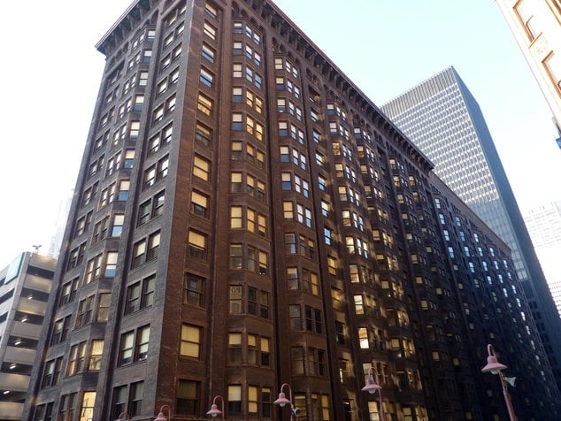
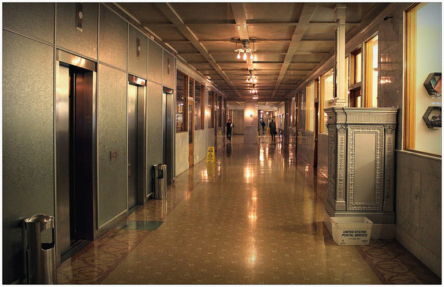
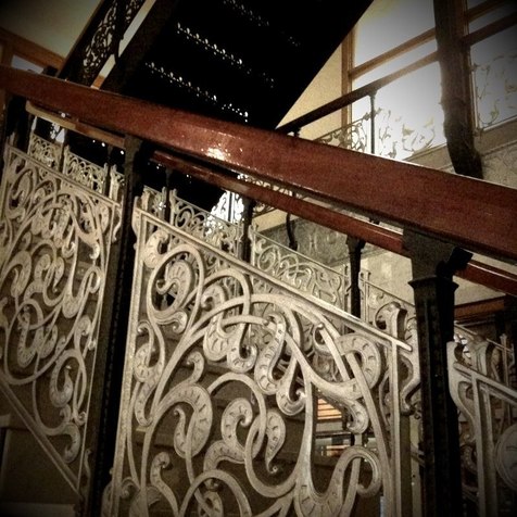
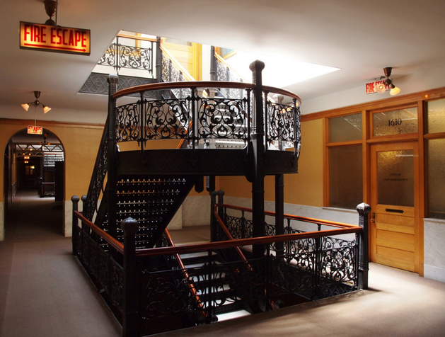
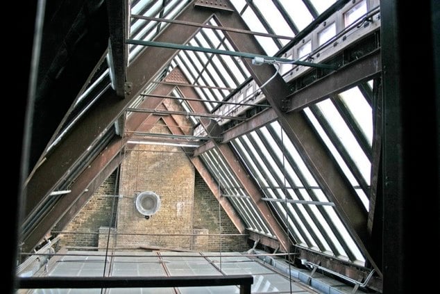
The Monadnock Building was, in 1893, the largest office building in the world (16 stories, 1 block long!); it was the first to be wired for electricity as it was built, and among the first to use cast aluminum (stair railings and a post office box). At the time aluminum was a new and "luxurious" material. Two firms designed the Monadnock: Burnham and Root designed the north half in 1891, and Holabird & Root designed the south half a year later. B&R's half was supported by the exterior walls, which carried the weight of 16 floors of exterior masonry and floors of iron and concrete, plus contents. The basement and first floor walls were very thick.
H&R designed the second half, supporting the floors on a steel framework which also carried [relatively light] curtain walls of brick and terra cotta. Both sides employed an innovative foundation. Since the columns did not rest on bedrock, and given the weight of the building, sinking would have been severe. B&R + H&R rested each column on a 3 foot thick pad of railroad ties and concrete below the basement floor--each pad being...maybe 10 ft. on a side. This remained standard until piling and pile-driving equipment became good enough to reach the rock below the thick lake bottom.
The Monadnock was restored 8 years ago and is fully occupied. The vintage 1893 light fixtures with 1893 style bulbs are precise duplicates and illuminate the hallways. I think quaint and kind of ugly describes them well. People wanted the light bulbs to be visible because electricity was the latest and hottest thing on the market. Each office has windows on the interior hallways, as well as exterior recessed and bay windows. (1893 was well before air conditioning -- cross ventilation was critical.) The interior windows also helped boost light levels in the hallways. The typical lightbulb of the time was equivalent to about a decorative modern 25 watt light.
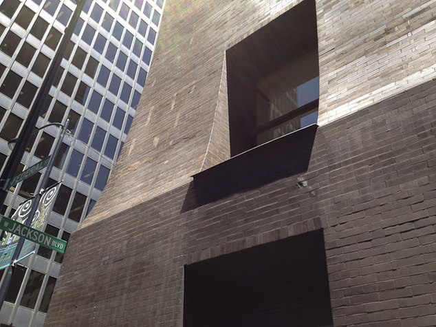
The first floor has been rented to the kinds of shops that were there in the early years: a cafe, a coffee shop (Intelligentsia Coffee and Tea), a hat shop, a clothing shop, a utility printing shop, and the like.
The South - second - building is more ornate because weight was much less of an issue given the steel frame. Also, the North building exterior had an Egyptian flavor, and elaborate ornamentation and a pronounced cornice would have been inconsistent.
Great place. TPF can rent space there for it's world wide operations, someday.


-
 BC
14.2k
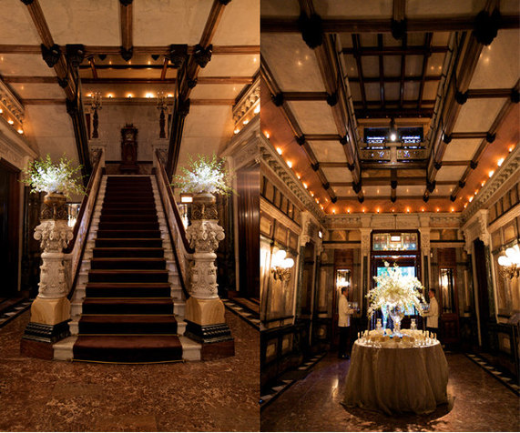
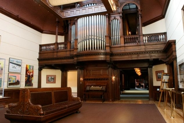
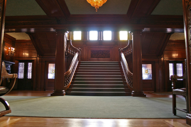
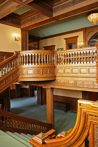
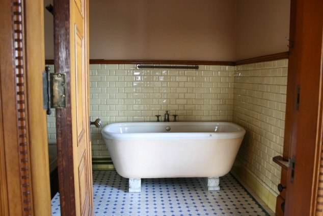
The Driehaus mansion on E. Erie, near the north side luxury shopping area (and Trump Towers) is the restored Gilded Age (think Robber Baron) home of some very rich people.
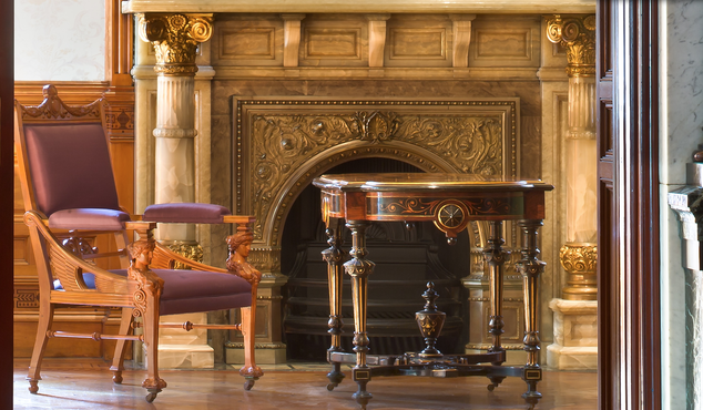
It was opulently decorated (and opulently restored over a century later). Did the liquor dealers and bank presidents, their wives, her sisters, cousins, and his aunts, know so much about interior decorating that they could not only pay for all this, but could careful pick it out at the store as well?
No.
A. Fiedler & Co.: Designers and Manufacturers of Artistic Furniture, Upholstered Goods, Hardwood Fittings, Draperies and Interior Decoration will happily tell you what to do with your money (not that they have any interest in profiting from their own advice, of course...). They decree:
-
We strongly advocate the use of different styles in different rooms, to avoid the monotonous effect invariably produced by the fanatic apostles of the so-called Eastlake or Modern Gothic. For the same reasons it will be necessary for articles of luxury, as Easels. Hanging Shelves, Cabinets, etc., to use motifs from the Mooresque, Byzantine, Japanese, etc., though diametrically opposed to the prevailing style of the room.
The same rule should be followed in the selection of carpets, coverings etc., or in the decoration of ceilings, and walls, in which harmonious contrasts are preferred to harmonious analogies, known as “matching.” The mistakes committed by unskilled hands in the former are more easily overcome than the stupid blunders made in the latter.
See, now I would never think of mixing Mooresque, Byzantine, Anasazi, latter day Danish, and South Asian kitsch. I don't want yet another school of decorating to step forward wherever my gaze rests. I want harmony and matching. But then, they were selling to late 19th century people with money, not 21st century people with no money.
Did I mention that the restoration was opulent? The cleaned the exterior using a laser method. (I suppose they vaporized the soot and dirt 1 sq. mm. at a time.)
Note that the ceilings are covered in marble. This wasn't wretched excess. The builders had lost their previous house (a little shed) in the Chicago Fire and they didn't want that to happen again. The house is made up of a series of brick boxes--all of the interior walls and spaces between floors are very fire-resistant if not downright fire-proof. The marble on the ceiling is part of the fire proofing.


-
 BC
14.2kJAMES J. HILL HOUSE (St. Paul, MN)

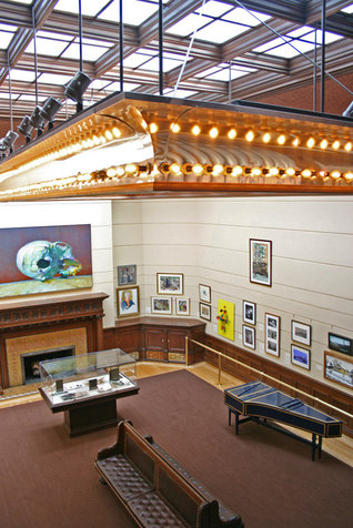
James J. Hill (of the Great Northern Railway) built his little bird nest in St. Paul. It's not less luxurious than the Driehaus mansion, but it is much less ornately decorated. It uses a lot of wood (it's practically a deforestation project), it's very spacious with porches on the back side that are larger than my lot, just about. It's very, very large.


-
 BC
14.2k
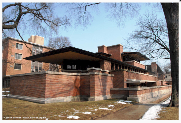
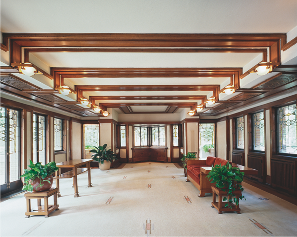
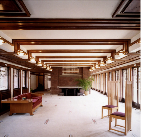
The Robie House is near the University of Chicago; it is perhaps Frank Lloyd Wright's finest design. It's a very significant building in the category of houses. Completed in 1910, the house Wright designed for Frederick C. Robie is the consummate expression of his Prairie style. The house is conceived as an integral whole—site and structure, interior and exterior, furniture, ornament and architecture, each element is connected.
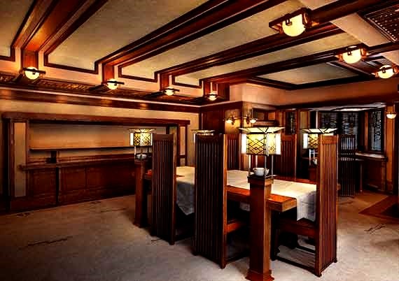
The dining room table and chairs (with built in lamps) are typical of Wright's furniture: it wasn't designed to make you comfortable, it was designed to express FLW ideas. Wright strongly objected to owners of his houses moving HIS furniture from the location HE intended for it.
The house now serves as a conference center and teaching facility.


-
 BC
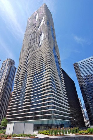
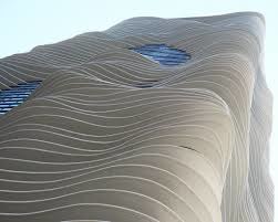
14.2kTrump Towers and Aqua
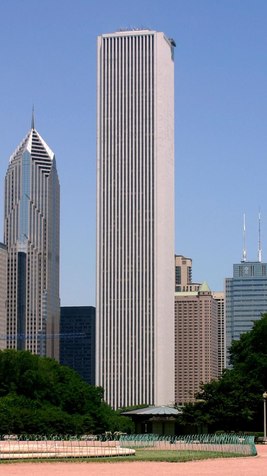
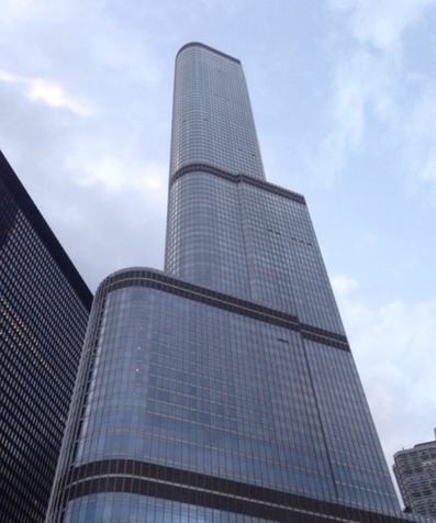
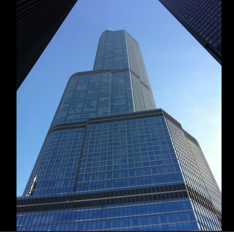
In order: Aon, Trump, Trump, Aqua, Aqua
Trump Tower, including the shaft on top, is the second or third tallest building in the country -- behind the WTC replacement bldg. and Sears Tower. It is actually quite lovely to look at. Hopefully Donald Trump will not become POTUS. God FORBID! We walked through the first floor lobby -- a total non experience, there's nothing there -- but we were still discretely followed by an agent of the Bourgeoisie. The pictures indicate a VERY HIGH level of luxury for those who are supposed to be in the building. (Not us, obviously.)
The Aqua building is, I guess, a fairly ordinary glass curtain wall building with a very elaborate system of balconies. It looks less weird in Chicago than it does in its pictures. Chicagoans, all experts on architecture -- every one of 'em -- voted it their favorite building. Odd. I predict their affection will wear off. None the less, it is a very interesting building.
The Aon Building is an Object Lesson. It was built in the early 70s (maybe late 60s) by Standard Oil as a HQ building. It was faced in lovely marble sheets. The architects were not familiar, (apparently) with Chicago weather, which is not similar to Miami or L.A. After just a few years the thin marble, under the stress of frigid weather, ice, wind, heat, humidity, etc. began to crack and peel. It's one think to have paint crack and peel; it's something else to have large pieces of marble cracking, peeling, and falling off the building from... oh, 800 feet up. Standard Oil had to take off all of the thin marble and put on some nice looking but much tougher stuff. It cost as much to fix the problem as it did to build the building in the first place.


-
 BC
14.2kThe Sancaklar Mosque is magnifique!
stone, concrete, water, earth
exterior light reflected into the interior space
very abbreviated colors, textures--visually quiet
powerful embracing enclosure built into the Turkish plains
Excellence in architecture.
Robert A. M. Stern holds that “the design of a sacred space is one of the greatest privileges that can be given to an architect,” positing an ecclesiastical building is “nurtured by place and rooted in ritual.” -
 Soylent
188The nature of the medium always matters. — Bitter Crank
This sounds like an artistic challenge. -
Cavacava
2.4kThe nature of the medium always matters; water color behaves differently than acrylic. Bronze behaves differently than marble. and so on. The same goes for architecture, except that it is critical that the media of architecture (steel, concrete, terra cotta, etc.) perform as specified, else the tower will fall down — Bitter Crank
I wonder how much the medium matters in Conceptual Art, where realization of the idea is the subject and object of the work. Of course in Architecture the matter is steel, concrete, stone, glass and so on, but especially in architecture, the work is the materialization of the design, which is prior to the work.
The Robie House by FLR and the Mosque appear to have many similarities. -
 jkop
1kThe physical nature of the material or medium is nowadays typically a domain for structural engineers, not architects. In a lot of contemporary architecture imagery (e.g. printed textures, patterns, pictures) seems to have a lot more significance than the nature of the material or medium.
Welcome to The Philosophy Forum!
Get involved in philosophical discussions about knowledge, truth, language, consciousness, science, politics, religion, logic and mathematics, art, history, and lots more. No ads, no clutter, and very little agreement — just fascinating conversations.
Categories
- Guest category
- Phil. Writing Challenge - June 2025
- The Lounge
- General Philosophy
- Metaphysics & Epistemology
- Philosophy of Mind
- Ethics
- Political Philosophy
- Philosophy of Art
- Logic & Philosophy of Mathematics
- Philosophy of Religion
- Philosophy of Science
- Philosophy of Language
- Interesting Stuff
- Politics and Current Affairs
- Humanities and Social Sciences
- Science and Technology
- Non-English Discussion
- German Discussion
- Spanish Discussion
- Learning Centre
- Resources
- Books and Papers
- Reading groups
- Questions
- Guest Speakers
- David Pearce
- Massimo Pigliucci
- Debates
- Debate Proposals
- Debate Discussion
- Feedback
- Article submissions
- About TPF
- Help
More Discussions
- Other sites we like
- Social media
- Terms of Service
- Sign In
- Created with PlushForums
- © 2026 The Philosophy Forum

