-
 Pinprick
957
Umm… it kinda depends. I mean, if I saw that in real life I’d probably puke, but I find beauty in it more so in how I interpret its meaning than just its aesthetics. I guess it’s similar to how people find stories beautiful. It has nothing to do with the way the words look. It’s about their meaning. -
 T_Clark
16.1kUmm… it kinda depends. I mean, if I saw that in real life I’d probably puke, but I find beauty in it more so in how I interpret its meaning than just its aesthetics. I guess it’s similar to how people find stories beautiful. It has nothing to do with the way the words look. It’s about their meaning. — Pinprick
Just to be clear, I didn't mean to suggest that I don't think it belongs in this thread.
It does kind of remind me of those old Monty Python graphics. -
 Pinprick
957
In case anyone isn’t familiar with Whitkin’s work, he is a photographer and often uses corpses and/or body parts for his photographs. In order to do this he made arrangements with local morgues who would essentially give him any bodies that went unclaimed/unidentified. So, he never really knew what he would be getting. With this particular image, so the story goes, he was lifting this head out of the box it came in, and dropped it. He didn’t realize that it had been dissected vertically, and when it landed it came apart and landed pretty much how he ended up photographing it. I mention this to show that I don’t think there was much intent involved on the part of the artist to create something with a specific meaning.
To me, I associate the image with Narcissus, or vanity. He is literally kissing himself. Couple that with the fact that this is a dismembered head and it brings about the contrast between “loving life” and “death.” Were this picture taken of two living people, it would appear very tender and loving. So, to me it kind of captures both tenderness/love on the one hand, and disgust/death on the other. There’s something I find fascinating about the ability to transform something that’s typically, or stereotypically, beautiful and lovey-dovey, like a kiss, into something darker. And just the ability to capture these different juxtapositions in one image is kind of awe inspiring for me. But it could be read into as a sort of warning about the perils of vanity, like Narcissus. Or you could interpret it as showing that most likely this person loved his life before he died, which again brings tenderness into an otherwise morbid image. But anyway, that’s my long winded explanation. -
 Tom Storm
10.9kA couple of wonderful, beutiful adds. I think they're from the early 2000s. Neither is made with computer generated images. — T Clark
Interesting. To me the first one seems like barely suppressed or symbolic violence and is striking but not beautiful, especially linked with Rossini's music, so well associated for some of us with the urban violence in A Clockwork Orange. And clowns are creepy. But that's the nature of beauty, it's very personal. I am generally unaffected by artworks, but I do enjoy antiquities. I am more likely to find music or prose 'beautiful' not so much visual works. -
 T_Clark
16.1kme the first one seems like barely suppressed or symbolic violence and is striking but not beautiful, especially linked with Rossini's music, so well associated for some of us with the urban violence in A Clockwork Orange. And clowns are creepy. — Tom Storm
It surprised me that you said violence, that never crossed my mind. Now that you say it, it makes sense. For me it was just joyful. I find myself moved by big public works of art. Things that get in the way and change the way people think about their everyday world and lives. I've always loved Christo's stuff. For me, that's art that doesn't need an expert to explain it. I can feel it in my bones. Apparently people in the locations where the commercials were filmed really enjoyed the process. -
 BC
14.3kWhen I saw this image on Tumblr, my first thought was 'very realistic painting". The fineness of the detail quickly persuaded me otherwise. Still, it seems a very 'painterly' photograph. It also is a bit difficult to place in time -- the station looks like something from the early 20th century, give or take a couple of decades, but the man, the suitcases, and the transmission poles in the background look much more recent. There is a Petersburg station in western Canada on the CP or CN railroad.
It's a very nice composition.
-
 Paine
3.2k
Interesting image. The angle of the shadows changes for different objects. The light source is lower when striking the cowboy. The infrastructure visible to the left of the station is absent to the left of it. The station does not cast a shadow beyond the platform on the right.
I like how the cowboy is a Marlboro Man gone to seed when zoomed in upon. -
 BC
14.3kOK, should there be a shadow to the right of the station? But the suitcase and cowboy shadow seem consistent with the bench shadow, the lamp shadow hanging on the left side of the station. and so on. The man in the window seems more like an added image--he's too close to the window glass and too short. Also, I see that the station belongs to the Grand Trunk line. Don't know much about the GT.
The photo certainly seems composed (not a snap shot) and perhaps manipulated. I still like it, particularly the grey/beige/slightly green palate.
Marlboro cowboy gone to seed... He doesn't appear to be old enough to be a seedy Marlboro cowboy, though I see what you are talking about. The cigarette mascots tended to be mature men with deeply weathered faces, from years of riding, roping, and smoking. He is lanky, though, like a cowboy ought to be. Do cowboys travel with luggage? No saddle bags?
Apparently Grand Trunk is not a double rail system out west. Side tracks are used to allow for passing trains. -
 BC
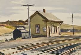
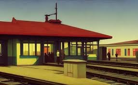
14.3kThere is something 'Hopperish' in his selection of topics. A difference though is that the colors in Hoppers paintings tend to use fairly saturated colors. The second one you posted, for instance.
The photograph I posted was by Dean West at Saatchi Art. Here's another Dean West photo; this one reminds me of David Hockney (painter) based on the subject matter and colors.
Palm Springs # 2, 2015 [LAST ONE] Artist Proof 2 of 296 W x 60 H x 0.1 D inDean West
Saatchi is asking $90,750 for the pool photo.
-
 Paine
3.2kOK, should there be a shadow to the right of the station? — BC
Given the angle of the other shadows, yes, there should be a bit of darkness to the right. There is no shadow of the fence either but that could be written off as the platform being too high. If one looks at the angle taken from the height of objects to the shadow cast, the cowboy's angle is greater than the others. And what is with the lantern casting a more washed-out shadow than the others?
I think there is an Escher thing underway along with the Hopper vibe. -
 Beverley
137
‘My’ Agios Nikolaos, as I call it. I am greedy. It is the town in eastern Crete, Greece, where I lived for 11 years, met so many friends— and my husband— the place that stole my heart, and so many others’ that I know.
I left in 2011. Funnily enough, I do not ever recall talking about philosophy whilst there. I didn’t even know what philosophy was until I discovered it in 2021 in Canada, of all places! -
 BC
14.3kBody building has a history, of course. 19th century circus acts (strong men lifting very heavy objects) popularized having musculature that was outside the norm. (There were, of course, very strong ag and industrial workers whose physiques were not celebrated.). In the US, Bernarr McFadden promoted "health and fitness". Himself a raw vegetarian, there are something of a "religion" about him.
How defined one's muscles will be depends on type and duration of exercise, amount of sub-cutaneous fat, muscle flexing during posing, and so on. Here's a picture of McFadden as a young mn, already practicing what he preached:
.
Bernarr McFadden
Raw vegetables and weight lifting worked for him. He was 87 when he died in 1955.
A lot of men who post pictures of themselves on Tumblr (and elsewhere) look pretty fit, but often their musculature does not appear with sharp definition. It isn't that they haven't done the work -- I suspect they are not starved enough to get very fine resolution of every vein, follicle, muscle, tendon, and bone
I'm not criticizing them -- I'd be grateful to look half as buffed. In the summer of 92 I did a lot of training for a series of 100 mile bike rides. I had the endurance and strength but not much definition. I was too well nourished, for sure.
Most men probably do muscle building for sex appeal. Most of them are not doing it as "art", even if they achieve beauty. Ballet and modern dance performers maintain their bodies for their art -- as do some other artists--musicians for instance. -
 BC
14.3kperhaps sex appeal is an art in itself — Lionino
Some people seem to be just naturally saturated with sex appeal, while others can take what they've got and make what they want, or what they think other people want. There is definitely an art to this. There are a few unfortunates who are (to most other people) sexually repellant. Usually this is not something they bear responsibility for. I'm thinking of 2 guys: one was short, had some skeletal / bone problems, very bad teeth, and had a speech impediment. He was a tax accountant. He was reasonably likable, but had zero sex appeal. The other guy was tall and very thin with wild grey hair and a long unkept beard. His nickname was Bicycle Mary -- he rode his bike to the main gay bar in all weather. In addition to looking like a crazy man, his behavior was a little crazy too. Zero sex appeal.
Those were two people out of a thousand.
Tattoos are a popular enhancements. They have come a long way since the days of the classic drunken sailor getting a tattoo he will regret in the morning. Many men are buying tattoos that are artful designs executed with skill (and quite costly). I would prefer people keep their face and neck free of tattooing, but... no accounting for taste.
Vestus virum reddit, the Romans said -- clothes make the man. The well-put-together outfit goes a long way to enhance one's appearance and presence. The guys who show up in black leather and chains are not doing anything different than the guys who show up in Brooks Brothers suits. A jacket and tie can be good bait, just as jeans with holes and a ripped sweatshirt can be.
It's all art, lower case 'a' and quite essential to human interaction. -
 javi2541997
7.3kI want to share in this thread a painting by Lars Hertervig. It is an oil on canvas. Hertervig was a magnificent and talented artist, but he suffered from schizophrenia, and he spent most of his life in a mental sanatorium. The doctors banned him from keeping painting because it produced in him a violent sexual desire. Nonetheless, I disagree with this. The practices of old times were not as precise as we know today.
The landscapes of Hetervig are always dreamlike. He was a boy full of melancholia, missing his parents when he was a student at Düsseldorf Arts Academy. I relate to him a lot.
By the way, I know this artist thanks to Jon Fosse. A great writer whose work I have already discussed with @Metaphysician Undercover and @Ø implies everything, for example.

Welcome to The Philosophy Forum!
Get involved in philosophical discussions about knowledge, truth, language, consciousness, science, politics, religion, logic and mathematics, art, history, and lots more. No ads, no clutter, and very little agreement — just fascinating conversations.
Categories
- Guest category
- Phil. Writing Challenge - June 2025
- The Lounge
- General Philosophy
- Metaphysics & Epistemology
- Philosophy of Mind
- Ethics
- Political Philosophy
- Philosophy of Art
- Logic & Philosophy of Mathematics
- Philosophy of Religion
- Philosophy of Science
- Philosophy of Language
- Interesting Stuff
- Politics and Current Affairs
- Humanities and Social Sciences
- Science and Technology
- Non-English Discussion
- German Discussion
- Spanish Discussion
- Learning Centre
- Resources
- Books and Papers
- Reading groups
- Questions
- Guest Speakers
- David Pearce
- Massimo Pigliucci
- Debates
- Debate Proposals
- Debate Discussion
- Feedback
- Article submissions
- About TPF
- Help
More Discussions
- Other sites we like
- Social media
- Terms of Service
- Sign In
- Created with PlushForums
- © 2026 The Philosophy Forum


